


 Alex Vereshchagin
Hundreds of new apps are published in mobile stores every day. With so much competition, it’s crucial for developers to make their apps stand out. One way to achieve this is by coming up with a unique, memorable name. A well-chosen name can leave a strong first impression and play a key role in building brand recognition down the line.
A smart naming approach blends marketing, psychology, linguistics, and visual communication. Top app developers typically start the naming process by diving deep into the niche: researching the market, target audience behavior, and the competitive landscape. A key step in the naming process is legal screening — checking for available trademarks, making sure domain names are free to use, etc.
When working on app names, it’s especially important to consider the unique naming patterns in each app store category. In the Travel category, we’ll take a closer look at phonetics, melody, associations, common naming models, and the use of keywords. We’ll focus in particular on the Roadtrips and Trip Planning subcategories. We’ll analyze which words appear in app titles, whether they’re part of the brand name, and why developers choose them. The goal is to spot trends, identify recurring patterns, and offer practical tips for successful naming in this category.
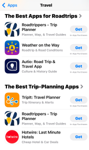
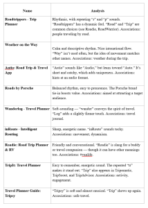
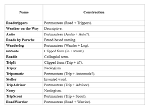
Apps we analyzed:
- Roadtrippers – Trip Planner
- Weather on the Way
- Autio: Road Trip & Travel App
- Roads by Porsche
- Wanderlog – Travel Planner
- inRoute – Intelligent Routing
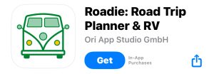
- Roadie: Road Trip Planner & RV
- Triplt: Travel Planner
- Travel Planner Guide: Tripsy
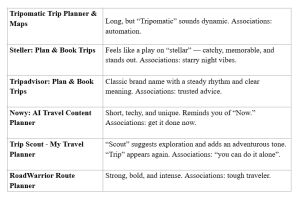
- Tripomatic Trip Planner & Maps
- Steller: Plan & Book Trips
- Tripadvisor: Plan & Book Trips
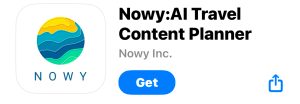
- Nowy: AI Travel Content Planner
- Trip Scout – My Travel Planner
- RoadWarrior Route Planner
Visual analysis
Visual optimization is a key element that works hand in hand with naming. Just like the app’s name, the icon shapes users’ first impressions, triggers associations, and influences brand recognition. Looking at app icons in the Travel category, we can see that most of them visually reflect the theme: location markers, roads, and navigation arrows are commonly used. For example, Roadtrippers combines the first letter of its name with a location icon. The Roadie app icon features a van, pointing to the idea of travel. Nowy highlights its name by including the logotype in its icon. TripAdvisor stands out with its signature logo that combines an owl and wheels — a combo that makes the app instantly recognizable. And the inRoute icon draws attention to a stylized “R” that’s closely tied to the brand.


Most icons stick to simple shapes and clear, themed visuals. Details are kept to a minimum since small features can get lost on smartphone screens and make an icon harder to read. Minimalism, on the other hand, helps with recognition: bold, easy-to-spot shapes are easier to notice and remember, especially with so much competition on the app stores.
Effective visual elements for Travel app icons are fairly limited — maps, compasses, cars, roads, luggage, globes, and curved lines. Still, even with this small set, it’s possible to stand out and capture your app’s vibe through an icon. This is important because emotional response always drives more interest and makes an app more appealing to users. Icons can also be tweaked by season — using colors that match the time of year — or updated with timely elements connected to current events. Just keep cultural differences in mind: what works in one region might come across differently in another.
A great example of strong visual optimization is Duolingo. Its app icon features the brand’s playful mascot, Duo, who changes expressions depending on the context. Recently, the company jumped on a trending moment by showing Duo in an accident with a Cybertruck. According to Similarweb, the campaign led to a 25% increase in active Android users compared to the previous year. On iOS, the day of Duo’s “death” saw record downloads — up 15% from the average, hitting 172,000 installs.

This case study shows just how powerful timely, bold responses to cultural trends can be. There’s room for that kind of creativity in the Travel category too — the kind that resonates with users and grabs attention. The key is not being afraid to experiment. One thing to remember: a static brand is a dead brand. While a brand that feels alive, even if it “dies” for a moment, can spark new interest and break download records.
 Anna Chernova
 Viktoriia Ronina