


 Alex Vereshchagin
Or how to create briefs for high-converting screenshots
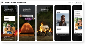
With thousands of apps competing for attention on the App Store and Google Play, standing out is becoming increasingly difficult. Every day, more apps are launched — and users take just seconds to decide whether to download or scroll past. That brief moment is your window to make an impression, and your screenshots are your most powerful tool to achieve this.
But screenshots aren’t just simple images of your app. They’re mini marketing campaigns, packed with visual messaging and ad design. To be effective, they need to hit three key goals: grab attention, communicate clearly, and inspire action.
1. Grabbing users’ attention
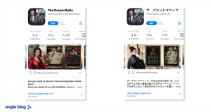
The first goal of a screenshot is to make your app stand out among similar ones. People usually don’t look at apps one by one — they scan several simultaneously. What catches their eye is something that stands out: a certain style, color, layout, or a clear visual message.
Bright colors, large elements, and bold headlines are good tools for drawing attention — but you shouldn’t want to stand out at any cost. Big brands, for example, have to follow brand guidelines, which limit how creative you can get and keep things consistent.
The message should be easy to understand and easy to remember on a subconscious level.
2. Communicate the core message visually
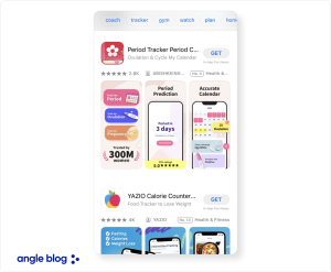
The second job of a screenshot is to quickly show what your app is about. Usually, you have 2–3 seconds. That’s how long it takes for a user to decide whether an app is useful for them. The main idea should come through visually — with graphics and short, clear text. If an app is paid and targeted at advanced users, it’s important to show details and features in the screenshots. People need to understand what they’re paying for. If that information is missing, they’ll just go with a safer option.
The ad message should:
- Use as few elements as possible (no visual clutter).
- Include icons or glyphs to instantly show meaning — for example, a shopping cart clearly signals a purchase.
- Be as short as possible — the golden rule is no more than ten words. The fewer words you use, the bigger the font and the stronger the message. It’s not about how much text you use, but what it says.
3. Get the user to take action
Visual ASO isn’t just about grabbing attention or getting the message across. The real goal is to turn that attention into action — usually a click on the app page and an install.
To get users to install the app, screenshots need to show what the app does and what they’ll get out of it.
Visual ASO always starts with defining what each screenshot is supposed to do. Before thinking about the design, an ASO specialist needs to be clear on the message and what kind of reaction they want from the user.
Glyphs: the language of symbols
When someone searches for apps on the App Store or Google Play, their eyes are immediately drawn to anything familiar and easy to understand. The faster they can identify what an app does, the more likely they are to take action. One tool that helps instantly convey meaning and simplify visual communication is the glyph.
Glyphs (from the Greek glyphē, meaning “carving”) are simple graphic symbols that act as visual anchors. Their job is to quickly and, almost subconsciously, communicate what an object or action is about.
People process visuals faster and more effectively than text. That’s just how we’ve evolved — our brains are wired to quickly recognize simple, familiar images. This works especially well in advertising, including app screenshots. A well-chosen glyph:
- cuts down the time it takes to understand a message;
- makes an ad’s message easier to process;
- helps the image stick in the user’s mind on a subconscious level.
According to basic principles of ad design, glyphs are the core of any visual message. Put simply, they’re the visual bridge between what you’re offering and what the user understands.
One of the key rules when using glyphs is not to use too many per screenshot. A glyph’s job is to deliver meaning quickly — not make things harder to read. Every extra element distracts the user and adds visual noise. That’s why the simpler the glyph, the faster it’s understood — and the faster the message gets across.
Glyphs should be as simple and clear as possible. In ad design, it’s standard to use symbols with minimal detail. Glyphs need to be easy to read:
- when viewed quickly;
- on screens of different sizes;
- in any lighting and even in black and white.
Do an experiment: switch your phone’s color settings to black & white and look at the icons and screenshots in search results. See what still stands out.
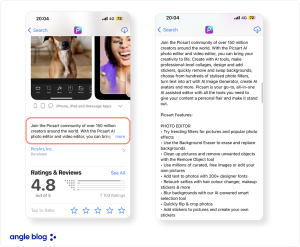
For a fast payment app, a simple wallet, credit card, or coin icon works well. For restaurants — a fork. For delivery — a container. These symbols are easy to understand, whether someone lives in the U.S. or in Indonesia.
By using glyphs, we create a simple, clear link between the offer and the user’s mind: see it, get the message, download. ASO specialists need to not only understand how important glyphs are, but also know how to give the designer the right instructions:
- Describe the main idea the glyph should communicate (e.g. “fast delivery” or “easy payment”).
- Specify a minimal, simple style — avoid details that make it harder to read.
- Limit each screenshot to no more than two key glyphs that reflect the main message.
Text in screenshots
Typography isn’t just about picking a font — it’s one of the key tools that makes your message noticeable. In ASO screenshots, text is just as important as visuals. For it to work well, you need to follow a few proven typography rules from years of ad practice.
One of the most important rules: short messages are easier to remember and more effective. People don’t read screenshot text carefully — they scan it. If the message is too long or complicated, they’ll just skip over it.
What to leave out of screenshot text
- Unnecessary words and repeated phrases. Don’t write things like “Our app helps you quickly and easily find a restaurant near you.” Just say “Find a restaurant in 5 seconds.”
- Complex technical or legal terms that most users won’t understand — that’s what the full app description is for.
- Vague or abstract claims that don’t say anything specific — like “the only one of its kind” or “a convenient service.” Always spell out the actual benefit: “30% off” or “15-minute delivery”.
It’s essential to check how well a text reads on your screenshots. One way to test this is to view the layout in black and white. If the text doesn’t come through clearly and quickly, it probably won’t work well in color either.
In practice, long texts are rarely used in ASO screenshots. The shorter the line, the easier it is to read when someone’s quickly scrolling through the app page. One or two lines is usually enough.
 Anna Chernova
 Viktoriia Ronina