


 Karina Krivoruchko
Every day, more and more fitness apps appear on Google Play and the App Store. Most offer personalized workout plans and training programs. With so many similar apps out there, a good name can help yours stand out. It should be easy to remember and clearly indicate what your app is for: building muscle, losing weight, boosting endurance, or simply staying active.
Creating an effective name for a fitness app means understanding your target audience, knowing the latest health and wellness trends, and thinking through both the marketing and linguistic angles. Your app name should sound strong, dynamic, and motivating — something users will associate with energy, progress, and results.
To analyze the process of naming a fitness app, we’ll look at a few key aspects: sound and rhythm, associations, naming models, and keyword use. In the end, we’ll offer some practical recommendations for building a strong name in the fitness category.
Examples of popular fitness apps
Here are the apps we analyzed for this breakdown:
- MyFitnessPal
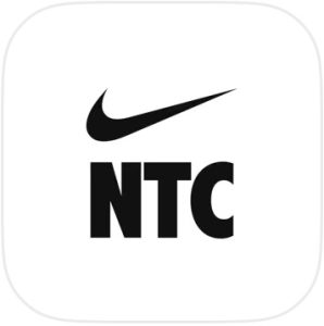
- Nike Training Club: Wellness
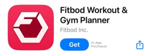
- Fitbod Workout & Gym Planner
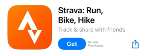
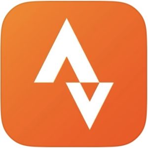
- Strava: Run, Bike, Hike
- Sweat: Fitness App For Women
- Centr: Personal Fitness App
- Seven – 7 Minute Workout
- Jefit Workout Planner Gym Log
- Adidas Running: Run Tracker
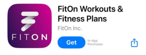
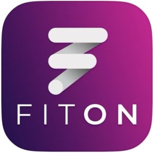
- FitOn Workouts & Fitness Plans
- StrongLifts Weight Lifting Log
- StretchIt – Stretching Video-Classes
Visual analysis
Visual identity plays a big role in how fitness apps are perceived. It helps build trust, shapes your brand image, and creates a connection with an active lifestyle. Here are a few key design principles and how they influence perception:
- Minimalism and movement symbols: Most icons use clean, simple shapes. That makes them easy to recognize, even on small screens.
- Color choices that affect how your app is perceived:
- Red, orange, and yellow signal energy, motivation, and strength.
- Blue, black, and white create a sense of reliability, tech, and professionalism.
Let’s look at a few examples:
Nike Training Club sticks to Nike’s signature minimalist style. Strava uses a simple but bold arrow-shaped icon. FitOn leans into movement and style with its stylized “F.” Fitbod uses a rich pink that’s associated with energy.
Takeaways on visual design:
- Simplicity is key to recognition. The fewer details you include, the better.
- Bright colors like orange, red, and blue grab attention and signal energy.
- Monochrome black-and-white designs give the brand a sleek, premium feel.
- Fonts should be bold and clear to reflect a sports spirit.
- Dynamic elements like slanted letters, arrows, and motion icons help highlight activity.
In short, visual identity isn’t just about looks. It’s a strategic tool that shapes how users see your brand and whether they choose to download your app. A well-designed aesthetic supports the name and sets the right expectations.
Sound, rhythm, and flow
Let’s look at how some popular app names sound:
- Strava – short, punchy, and dynamic. Reminiscent of “strive.”
- Fitbod – combines “fit” and “bod” (body); sounds energetic.
- Freeletics – merges “free” and “athletics.” Strong rhythm.
- Sweat – a one-syllable word that gets straight to the point.
- Jefit – a unique but easy-to-understand neologism.
- Centr – a stylized spelling of “center,” gives the name a modern feel.
- MyFitnessPal – a descriptive name, but “Pal” adds a friendly touch.
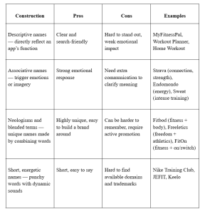
Most of these names are rhythmic and energetic, often using strong consonants like T, R, S, F, P, and D. Short names tend to be more memorable — but they’re also harder to trademark.
Commonly used words:
- Fit/Fitness – highlights the category.
- Train/Workout – focuses on training.
- Run/Move/Sweat – adds a sense of motion.
- Strong/Power – signals strength.
- Club/Pal/Coach – suggests support and community.

 Alex Vereshchagin
 Anna Chernova